The Henry Louis Gates Jr Fellowship Brand Design
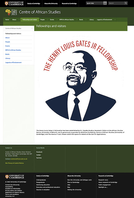
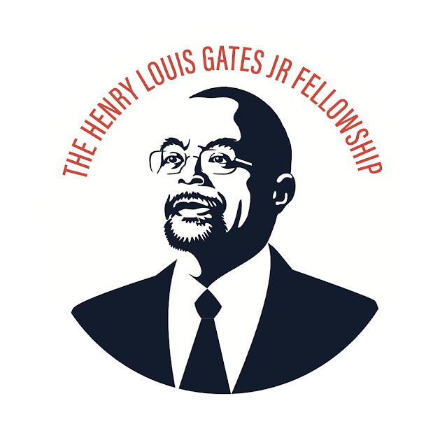
I was invited to design the logo for the newly established Henry Louis Gates Jr Fellowship at the University of Cambridge. Working on a distinguished subject is nothing to be taken lightly and every effort was taken to ensure Mr Gates' persona, stature and legacy were represented with dignity – to last for years to come.
 |
| September 2022 |
 |
| Example against a colour/dark background |
I decided to use a simple black (dark blue) and white treatment for the portrait rather than a detailed illustration, and relying on the negative space and shadows to create the final effect – no outline or outside edge to the white highlights on Henry Louis Gates Jr's face. And therefore important that it always displays against white. This would give the logo more impact and strength no matter the size. I then opted for simple typography – the main logo featuring the lettering arcing above the head of Henry Louis Gates Jr. Although I would have liked to incorporate the red, yellow and black of the university, I kept it simple with the red only, and rather than a harsh black, the deep blue/grey.
The initial illustration (not shown here) was a front-on portrait, but these rarely work for simple illustrations or logos as the shape of the features (nose, chin etc) tend to flatten and lose much of the person's character – character being vital here.
The pose I settled on was one that is noble and thoughtful, and, again, exemplifying the key features of Mr Gates.
Because various iterations are needed – whether on letterheads, social media or websites – I produced a number of versions that retain the brand's identity no matter their application.


