Simon & Siouxsie Branding (2019)
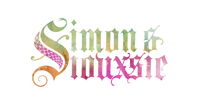
I dusted off the old Blackletter calligraphy to have a heap of fun designing the logo for two awesome reptile-friendly humans.
 |
| Final Design |
 |
| Final Design |
A single logo but with two distinct people working together as a team.
I dusted off the old Blackletter calligraphy to have a heap of fun designing the logo for two awesome reptile-friendly humans 🐍❤️ @simonkeysofficial and @siouxsiegillettofficial (Snake City) Elements of tattoos and reptiles. Who can ask for a better brief! #logo #designing #calligraphy #brand #corporateidentity
Hosts of the successful NatGeo WILD series, Snake City, Simon and Siouxsie needed a brand identity that represented who they are and their passion – reptiles and tattoos. Blackletter has a certain edge to it, and with the combination of snake scales and a custom “S”, they gelled nicely.


In my view, all logos have to work in black and white. With that as the solid groundwork, I then added watercolour for the full colour treatment – and the colours needed to represent the individual and their own personalities. A single logo but two distinct people working together as a team.

I was then asked to create an email “handout” for interested venues to host the duo and for their roadshows around the UK, USA and South Africa – or wherever they are needed. This was an excellent opportunity to develop their brand further.
 |
| Presenter Brochure Cover |
I took their colourful publicity stills and cranked up the contrast and used a simple black and white treatment to juxtapose alongside their brand identity and the colours in the rest of the design pages.


