International Coatings Group (LOGO – 2019)
Rebranding is a fine line between reinventing and revitalising.
We were asked to relook the existing brand identity for US-based ICG, but not stray too far from what the industry recognises already.
THE PROCESS: Taking our lead from the existing identity (bottom of page), and apart from some cosmetic refinements (spacing, font, alignment), we felt the logo lacked the “fire” component of the company’s fire protecting paint solutions.
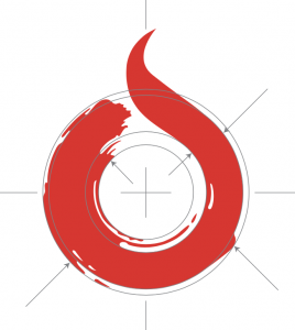
THE LOGOMARK (emblem): It was firstly important to maintain symetry no matter what we did, and set about working within a circular dimension. Then, by extending the “C” around and upward into a flame we gave some extra dynamism to the stroke effect. Simplicity is a key factor on the likes of social media where small logos need to work, so we simplified the rough paint effect as well as added the ICG lettering – important when the emblem/logomark stands alone.
![]()
VARIATIONS & THE BRAND BIBLE: Providing the client with options as well as suggested usage is important, especially when you as an agency are not involved in other aspects of the company’s projects – from product manufacturing to business communications. Giving them a document they can pass on to new employees and business associates helps keep the brand identity consistent across all media. This is the vital role of the Brand Bible.
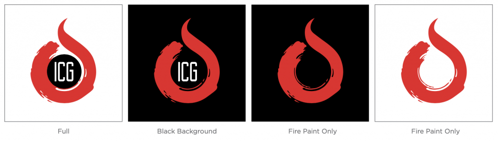 |
| Logomark Variations |
 |
| Logomark Variations |


