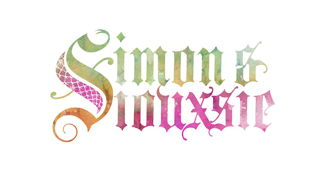
Simon & Siouxsie Branding (2019)

I dusted off the old Blackletter calligraphy to have a heap of fun designing the logo for two awesome reptile-friendly humans. Final Design Final Design A single logo but with two distinct people working together as a team. I dusted off the old Blackletter calligraphy to have a heap of fun designing the logo for two awesome reptile-friendly humans 🐍❤️ @simonkeysofficial and @siouxsiegillettofficial (Snake City) Elements of tattoos and reptiles. Who can ask for a better brief! #logo #designing #calligraphy #brand #corporateidentity Hosts of the successful NatGeo WILD series, Snake City, Simon and Siouxsie needed a brand identity that represented who they are and their passion – reptiles and tattoos. Blackletter has a certain edge to it, and with the combination of snake scales and a custom “S”, they gelled nicely. In my view, all logos have to work in black and white. With that as the solid groundwork, I then added watercolour for the full colour treatment – and the colours needed to r...
